Urban Fieldworks
Urban Fieldworks is an exercise that investigates the ordinary happenings and encounters found within an urban landscape.
Scan In The City
Hawker centres are seen as a staple culture here in Singapore, and we are curious to study and observe how they adapt alongside technological advancements in this widely digital era.
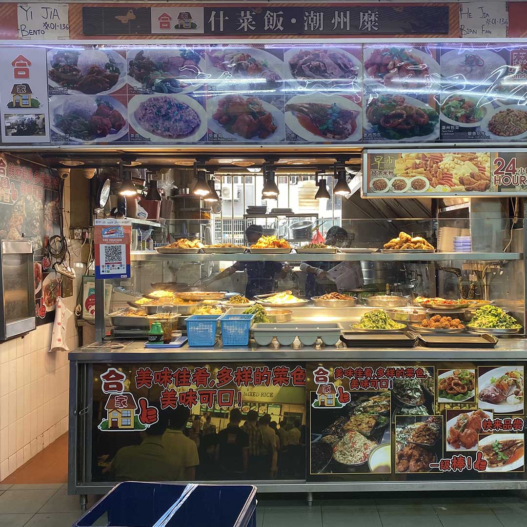
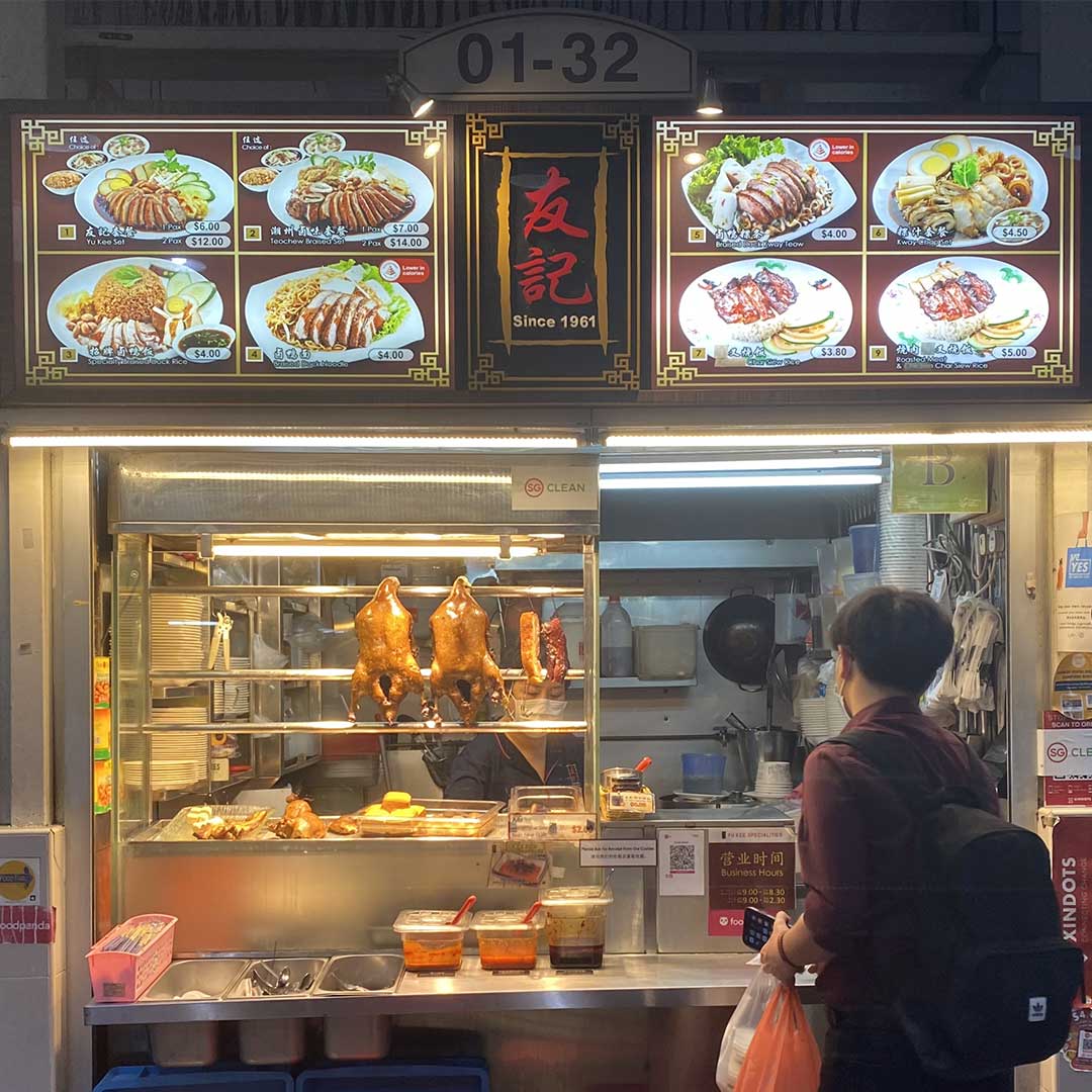
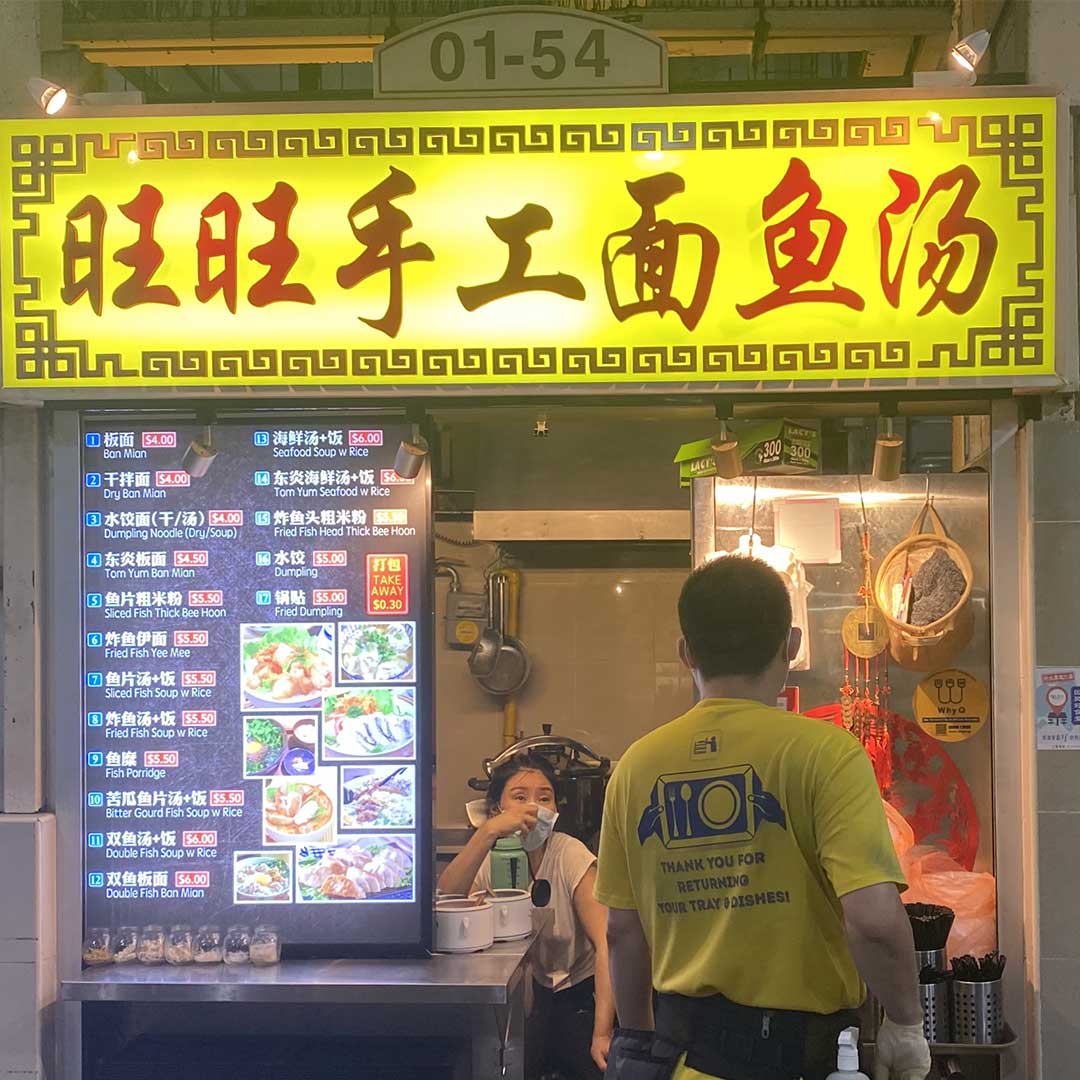
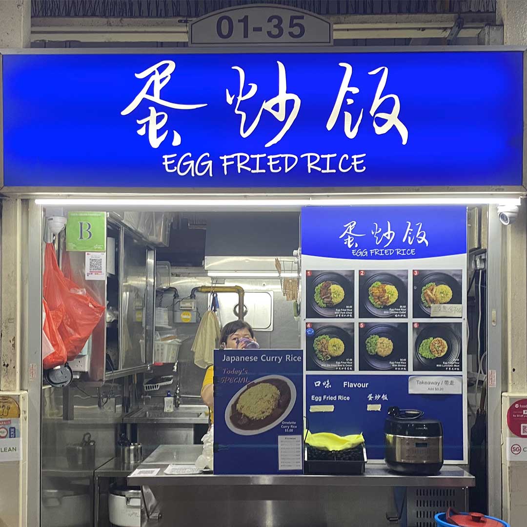
Scan in the City is a data collection project of QR Codes in traditional hawker stalls. The aim is to study the transition of traditional hawker stalls as they begin to allow contactless payment into their business, adapting to the rise of the digital era. As a comparison, our team visited hawker stalls in 3 different demographic areas – neighbourhood, CBD and touristy areas.
Channel News Asia, “Going cashless at hawker centres: Challenges and opportunities”, 2017. link here.
Field Trip
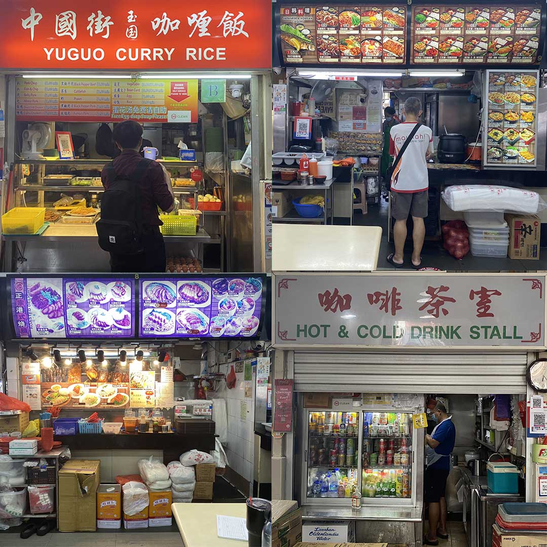
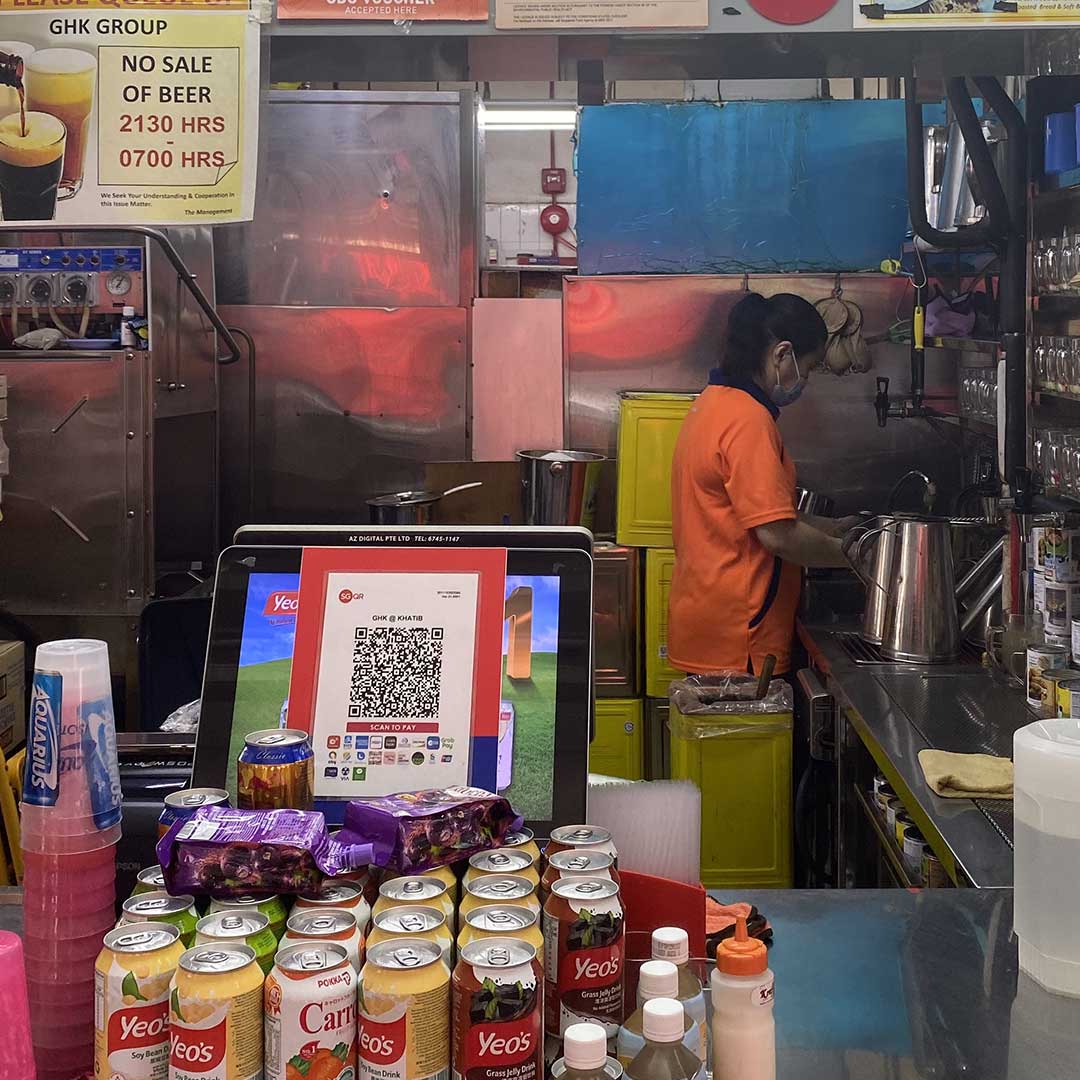
In the CBD areas, QR codes are easily accessible compared to tourist areas. This is probably due to the fact that tourist places are usually filled with foreigners using exchanged cash. Overall, the neighbourhood hawker centres are slowly adapting to methods of cashless payment, especially in popular stalls that will attract the younger crowds.
Our Field Trip Gallery
Data
We ran our spreadsheet data into p5js to produce this bar graph. The process was relatively simple as we only needed to convert the spreadsheet file into a CSV (comma separated values) file, in order for the program to properly execute the code.
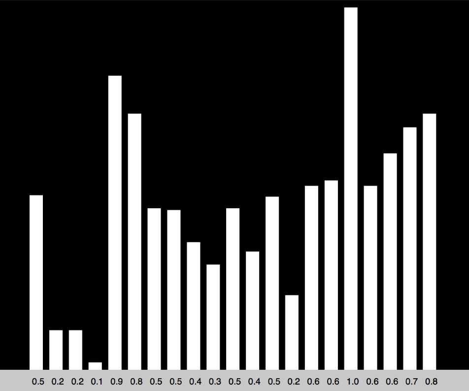
Our data shows that tourist areas have the least QR codes available, this could be due to the fact that tourists prefer to use cash rather than foreign internet banking services. QR codes are popular at hawker centres in the CBD area as working office folks do not typically carry cash and prefers effeciency. The neighbourhood areas are slowly adapting; this method of payment is especially abundant in popular stalls that attract a younger crowd.
Below you can find an excerpt from the data we have used. Based on the percentages of stalls with QR codes in each are, it shows that:
| Area | Percentage |
|---|---|
| CBD | 85% |
| Neighbourhood | 56% |
| Touristy | 32% |
Artefact
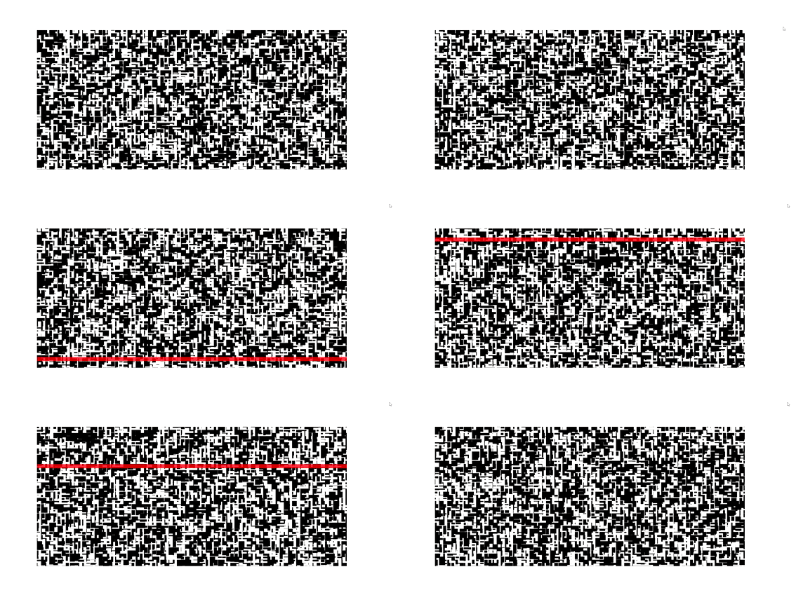
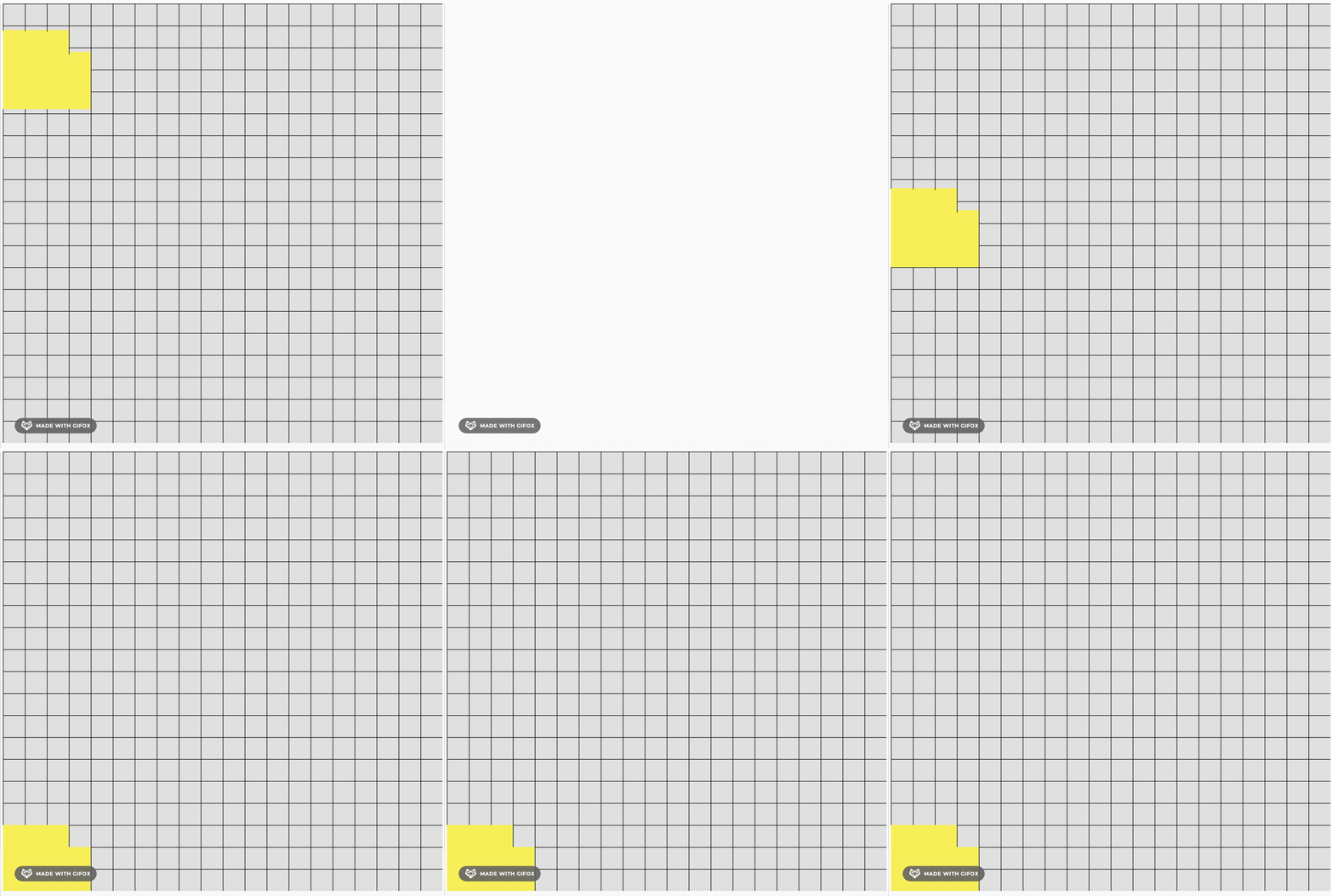
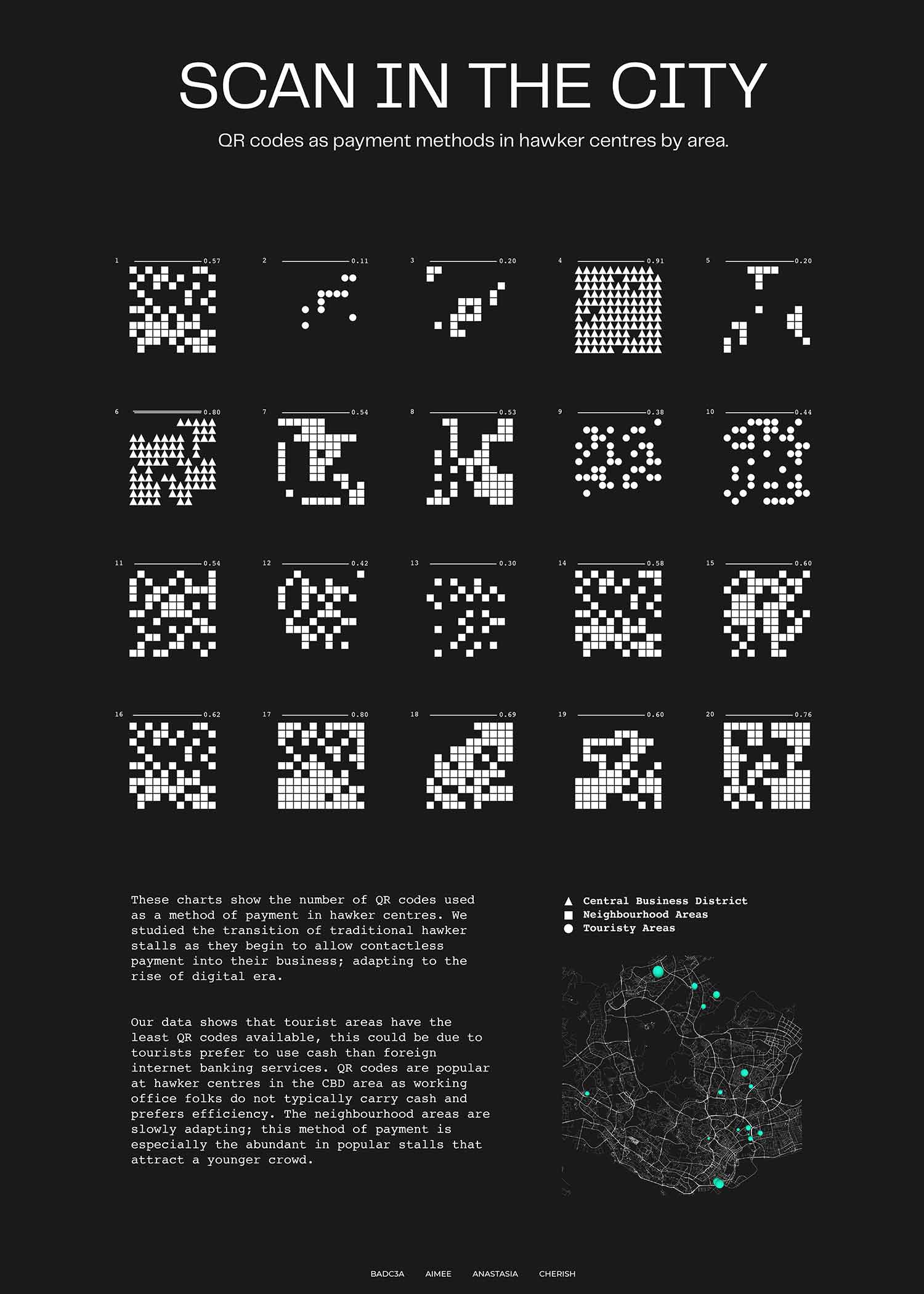
A bar graph was able to present our data in a straightforward manner however we wanted to elevate the presentation of our data which brings us to our final artefact comparison of waffle charts. Afterwards it was randomized to look more generative like QR codes. The different shapes that make up our charts each represent different locations of the hawker centres – neighbourhood, CBD and touristy areas.
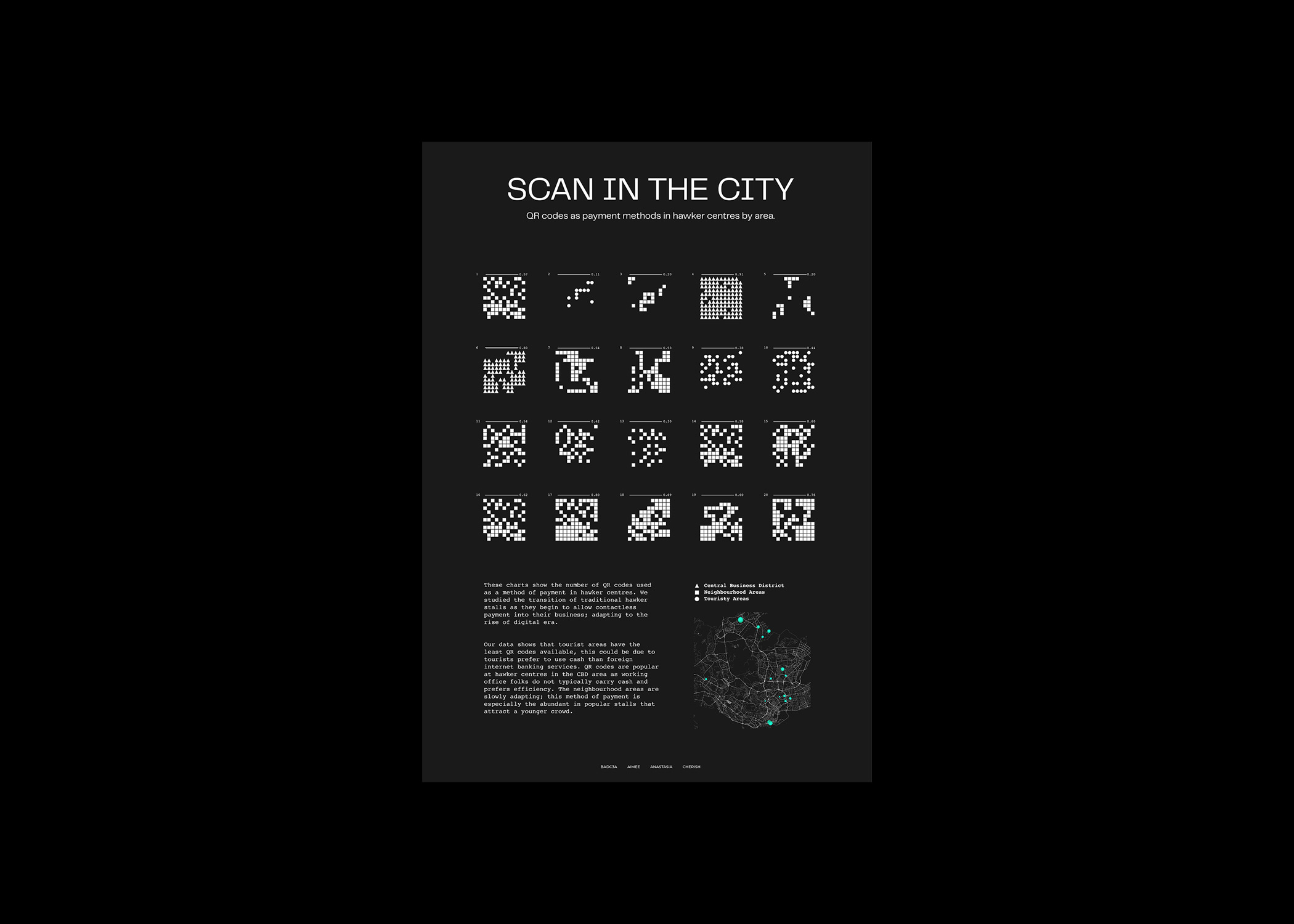
The process of designing our artefact involved many cutting decisions and discussions between our team members. Initially, we were ambitious and strived to create complicated solutions that involved using p5js code. We found a lot of difficulty and could not produce a satisfactory outcome, as a result we thought it was best to prioritize readability and sending our strong message clearly.
Reflection
As we gave our project presentation to the class, we received great feedback and reactions from our lecturers and classmates. Our poster communicated well and many were able to understand the message relayed. Even though we could not produce a beautiful mess of generative art through coding, there is always time and opportunities to practice the field.
.jpg)
