Code and Data
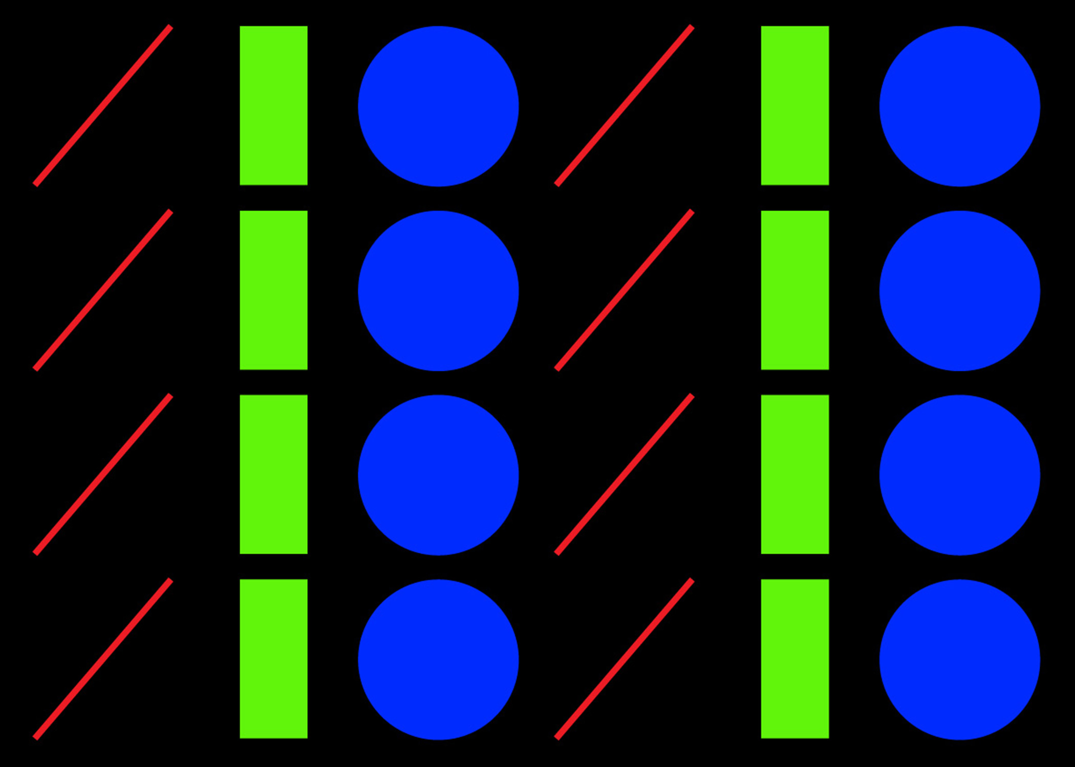
Code and Data looks at different types of data and graphs. A numeric data set is formatted first and then displayed through code. Three types of graphs are addressed here: Line, Bar and Donut graph.
3 Graphs
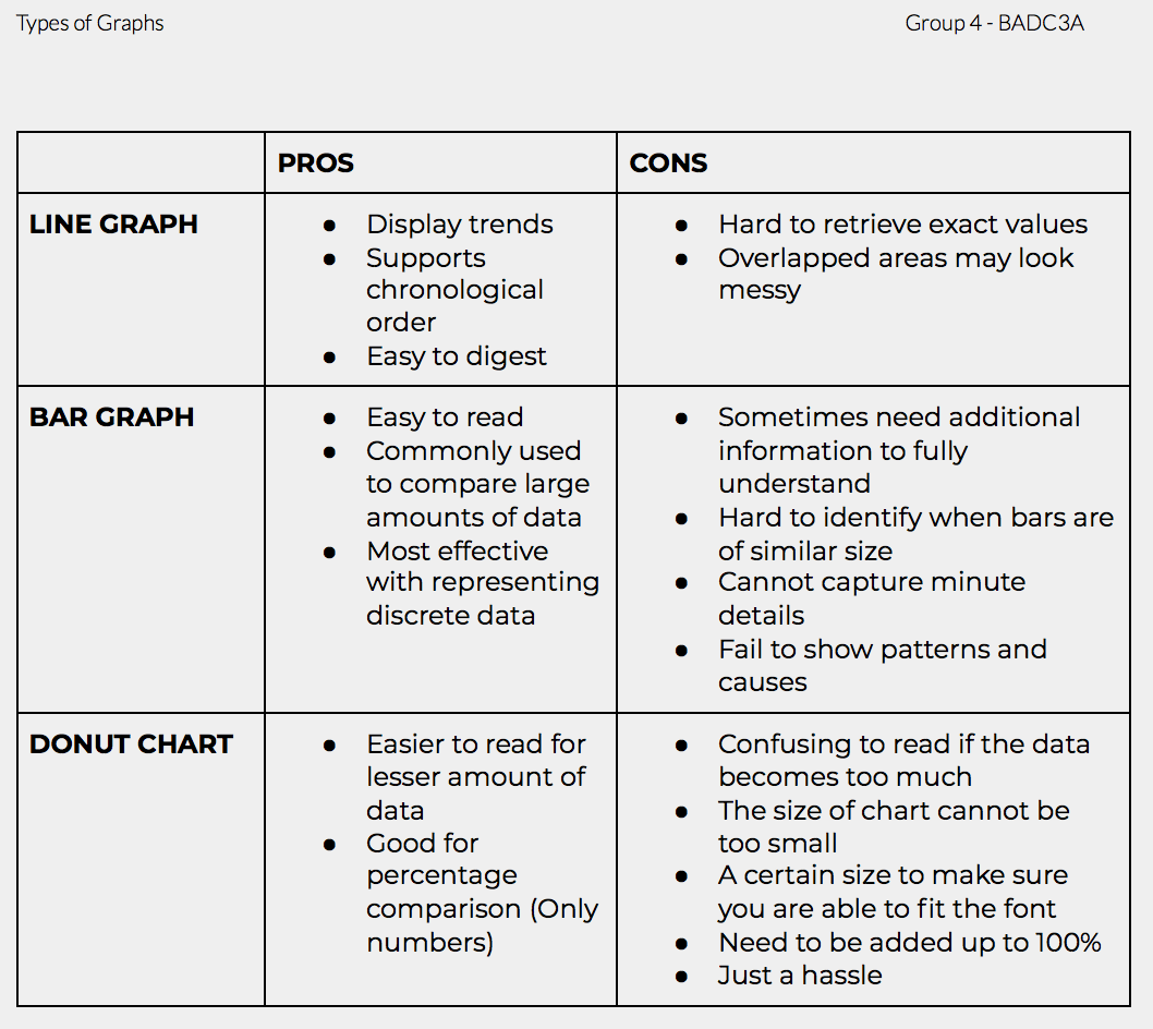
Our first data and code exercise allowed us to learn more about the differences of each graph type – line, bar and donut. We dissected the advantages and disadvantages of each graph in order to discuss which was most suitable to display our information in. Below is a summary of our findings and explorations using each type of graph.
Line
Line graphs are changed according to the Y and X axis; using the coordinate points on the graph to represent the value of the data that connects with a straight line. It is a straightforward method of displaying values as it only requires plotting the data into the graph’s axis. Using a line graph also allows for comparison of values and seeing the trends of each high and low points.
Bar
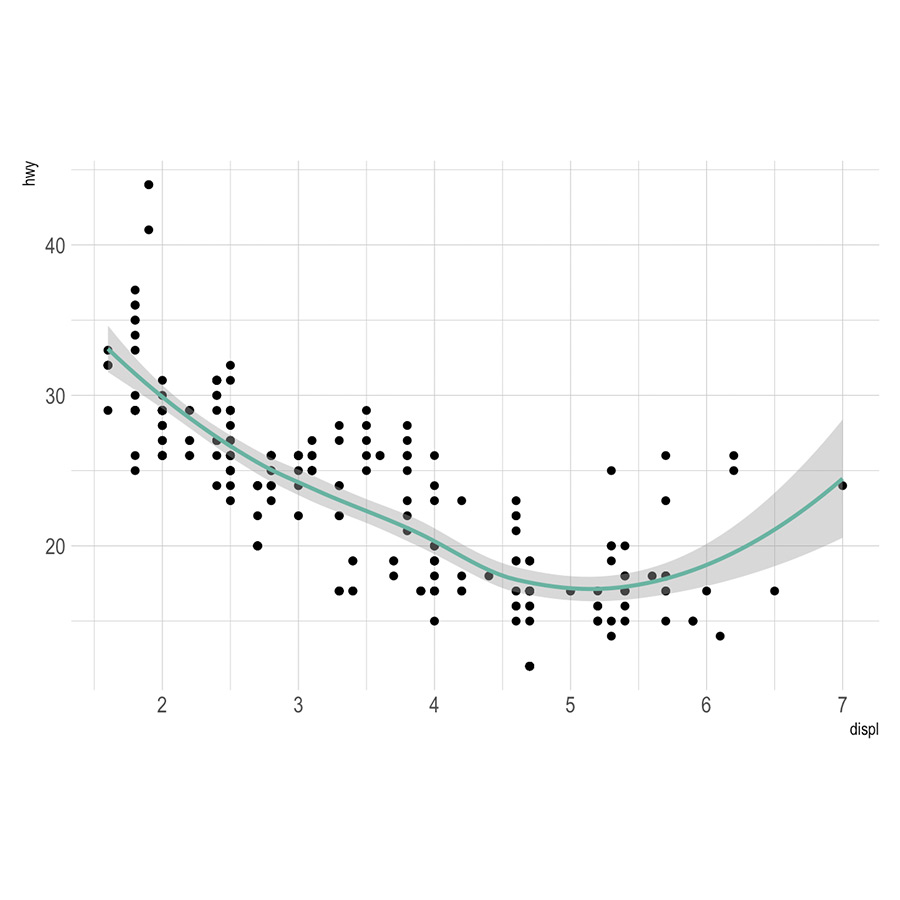
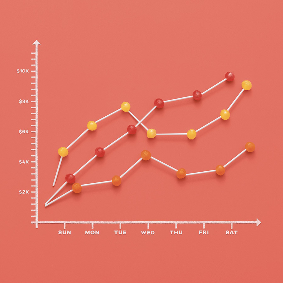
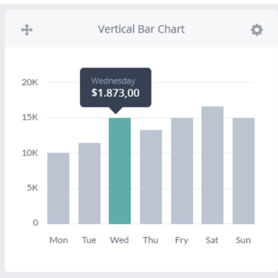
There are 3 different types of bar graphs but generally they are rectangular bars whose length are proportional to the data they represent. It is often used to compare a vast amount of data, by assigning different colors that means different values. One axis shows the category of the data being compared, while the other shows the measured value.
Donut
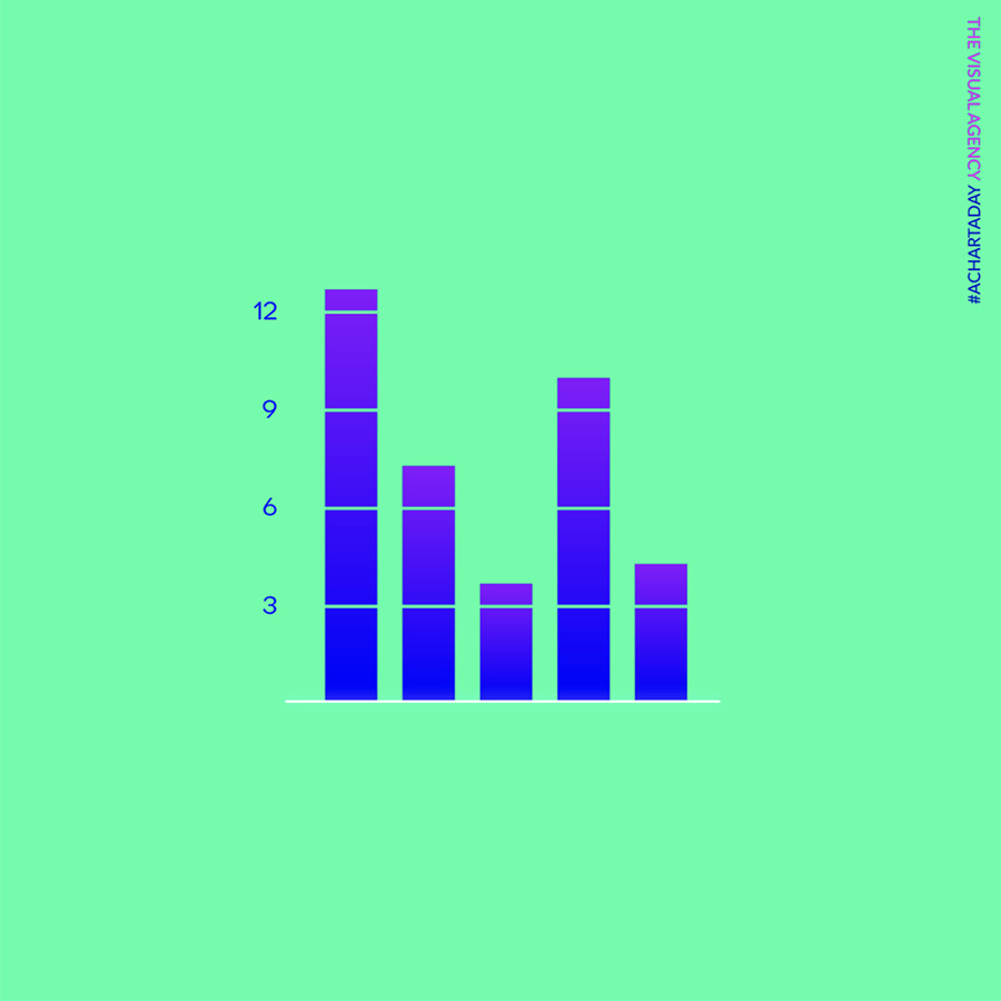
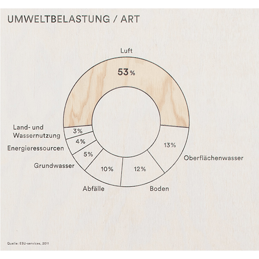
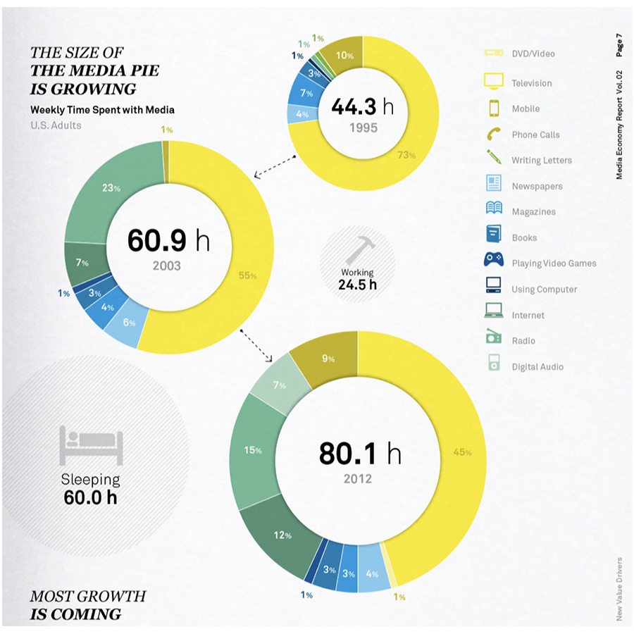
A donut graph uses the same concept of a circle. The donut chart above shows 3 different data, it is untidy and confusing to do with comparison and usually used on smaller datas. It displays categories as arcs rather than slices. Both make part-to-whole relationships easy to grasp at a glance. They differ from line charts, area charts, column charts, and bar graphs in that they can't show changes over time.
With the data we realise that bar graphs are generally more consistent compared to the line or donut graphs. Hence, the bar graphs are also proportional and consistent to the data they represent and often compared in vast amounts of numbers. Overall, the preferred choice was chosen.
Your Data Graph
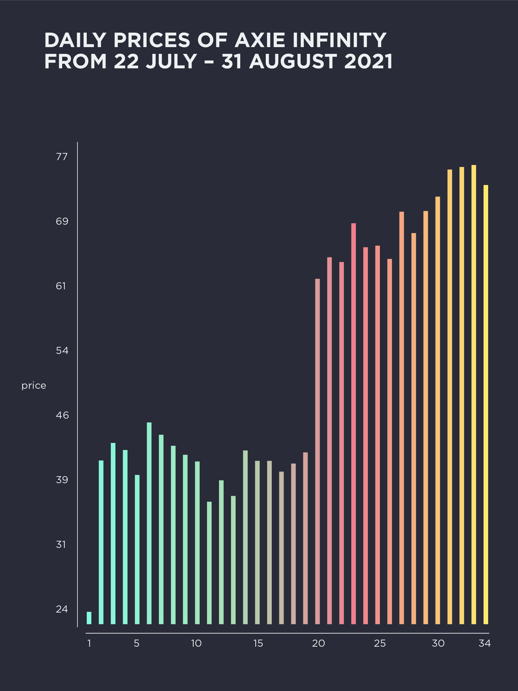
From this first graph above, we can see that the prices of Axie Infinity have progressively increased over the days. There are slight ups and downs in between phases while maintaining the overall increase.

.png)
We can conclude that Axie Infinity is relatively profitable within 5 to 7 days. The decrease in prices are often smaller than the larger increases that continuously trends.
Below you can find an excerpt from the data we have used. Based on a data set on Climate Change recorded since 1896, we have extracted the following data points that we have worked with:
| N | Price (in thousands) |
|---|---|
| 1 | 24 |
| 2 | 42 |
| 3 | 44 |
| 4 | 43 |
| 5 | 41 |
| 6 | 47 |
| 7 | 45 |
| 8 | 44 |
| 9 | 43 |
| 10 | 42 |
| 11 | 37 |
| 12 | 40 |
| 13 | 38 |
| 14 | 43 |
| 15 | 42.5 |
| 16 | 42.5 |
| 17 | 41 |
| 18 | 42 |
| 19 | 43 |
| 20 | 64 |
| 21 | 66.5 |
| 22 | 65 |
| 23 | 70 |
| 24 | 67 |
| 25 | 67.8 |
| 26 | 66 |
| 27 | 71 |
| 28 | 69 |
| 29 | 71.9 |
| 30 | 73 |
| 31 | 76 |
| 32 | 77 |
| 33 | 77.3 |
| 34 | 75 |
Data Interpretation
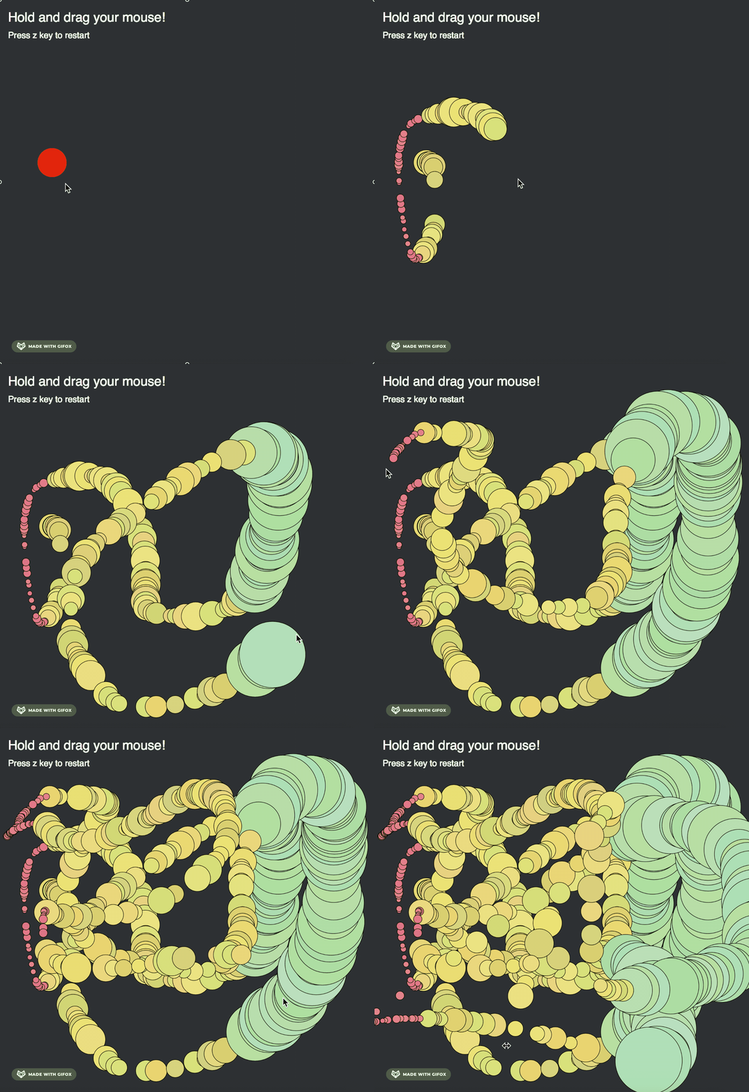
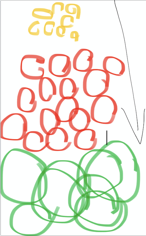
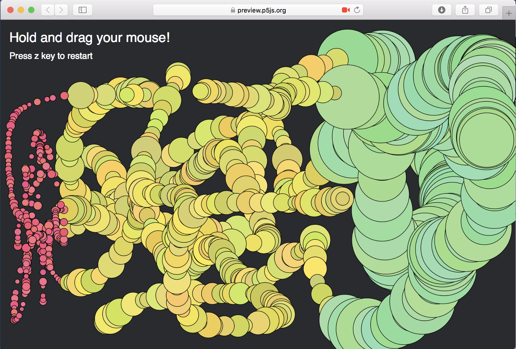
For Axie Infinity’s data, the bar graph is separated from left to right by the use of growth in data and colours. Another interpretation used was an interactive sketch we refer to as the drawing machine. The code produces an ellipse of different size and colour through the computer’s cursor movement. The change in size and colour represents the chronological stages of Axie Infinity’s prices. The random function is used to determine the size of the ellipse within a range of minimum and maximum values to mimic the ups and downs in between phases.
